As an interior design enthusiast who has spent years observing color trends come and go, I can confidently say that 2025 has brought us something truly spectacular: the triumphant return of dark violet. This isn’t just another fleeting trend—it’s a sophisticated color revolution that’s transforming how we think about elegance in our homes.
Table of Contents
- Why I Believe Dark Violet is This Year’s Game-Changer
- The Emotional Impact: What Dark Violet Does to Your Space
- My Favorite Dark Violet Color Combinations
- Room-by-Room: Where Dark Violet Works Best
- Lighting Secrets for Dark Violet Success
- Textures That Make Dark Violet Shine
- Budget-Friendly Ways to Embrace the Trend
- Professional Tips I’ve Learned Along the Way
- Making Dark Violet Work Year-Round
- Why Dark Violet is Here to Stay
Why I Believe Dark Violet is This Year’s ⁶#why-dark-violet
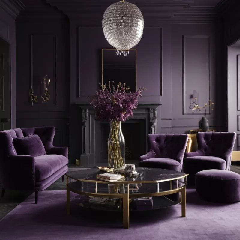
After years of beige and gray dominating our interiors, I’ve witnessed a dramatic shift in what homeowners want from their spaces. We’re craving personality, depth, and colors that tell a story. Dark violet delivers all of this and more.
What makes dark violet particularly compelling is its unique ability to be both bold and sophisticated simultaneously. Unlike trendy colors that quickly feel dated, dark violet possesses a timeless quality that I’ve seen work beautifully across various design styles and home types.
The major paint companies have taken notice too. Sherwin-Williams has been featuring rich purples in their trend forecasts, while Benjamin Moore continues to expand their violet offerings. This industry backing isn’t coincidental—it reflects a genuine consumer demand for more meaningful color choices.
In my experience working with clients, I’ve found that dark violet satisfies the modern homeowner’s desire for Instagram-worthy spaces that also feel genuinely livable. It photographs beautifully under various lighting conditions while maintaining its sophisticated appeal in person—a rare combination in the world of interior colors.
The psychological appeal cannot be understated either. Dark violet connects with our deeper desires for creativity, luxury, and spiritual calm. These associations make it perfect for creating spaces that aren’t just beautiful to look at, but genuinely nurturing to inhabit.
The Emotional Impact: What Dark Violet Does to Your Space #emotional-impact
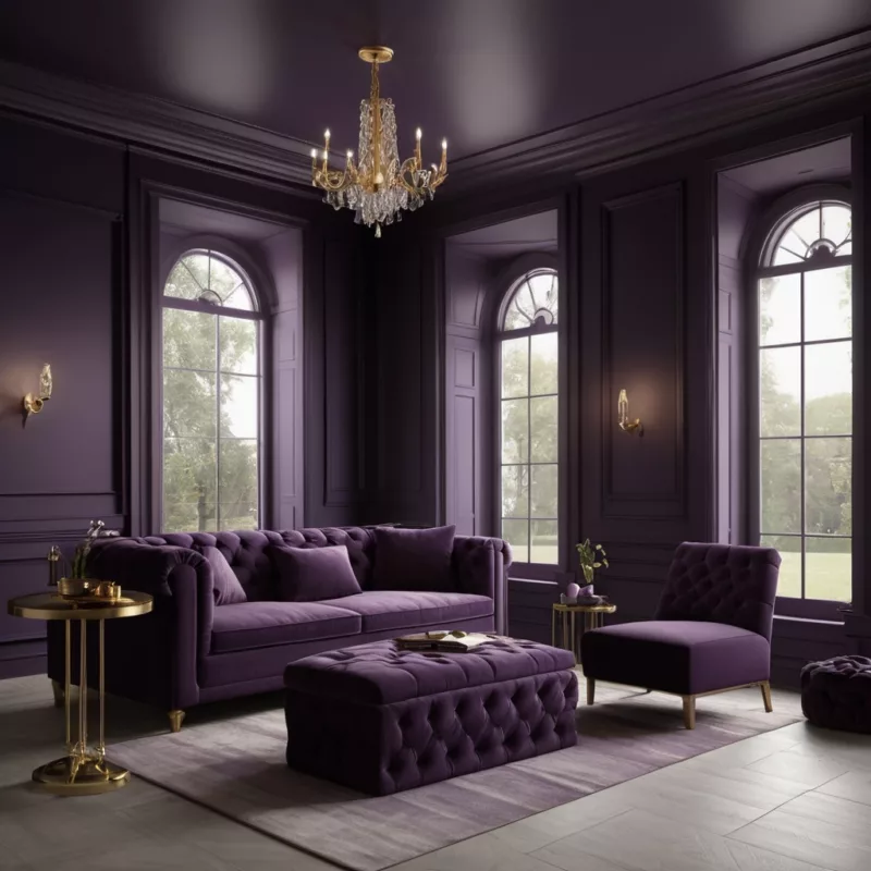
Through my years of design work, I’ve become fascinated by color psychology, and dark violet consistently proves to be one of the most emotionally complex colors in the spectrum. When I introduce it into a client’s home, the transformation goes far beyond the visual.
Dark violet has this remarkable ability to make spaces feel more expensive and carefully curated, regardless of the actual budget involved. I’ve seen it elevate a modest living room into something that feels like a luxury hotel suite, simply through strategic color placement and proper styling.
The color’s association with creativity makes it particularly powerful in home offices and creative spaces. I’ve had clients report increased focus and inspiration after incorporating dark violet into their workspaces. There’s something about the color that seems to encourage deeper thinking and artistic expression.
For bedrooms, dark violet creates an atmosphere of intimate luxury that’s hard to achieve with other colors. The key, as I’ve learned through trial and error, lies in balancing the intensity with softer elements. When done correctly, a dark violet bedroom becomes a true sanctuary—a space that feels both dramatic and deeply restful.
However, I’ve also learned that dark violet requires respect. Too much can overwhelm a space and create feelings of claustrophobia. The secret is understanding how to use it strategically, which brings us to successful color combinations.
My Favorite Dark Violet Color Combinations
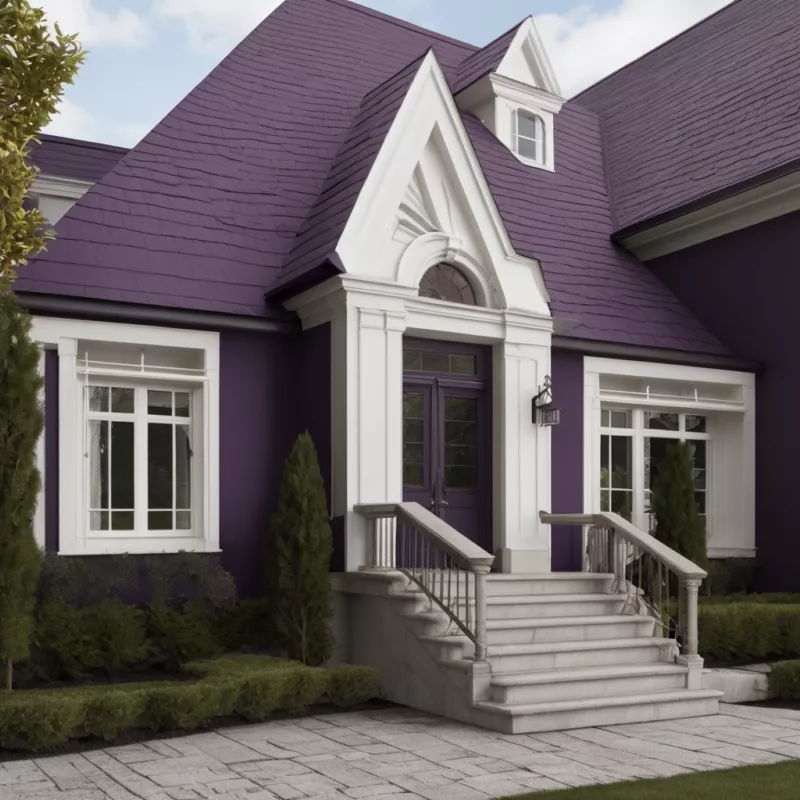
Over the years, I’ve developed several go-to color combinations that never fail to create stunning results with dark violet. These pairings have become my signature approaches, refined through countless projects and client collaborations.
The Classic Luxe Palette
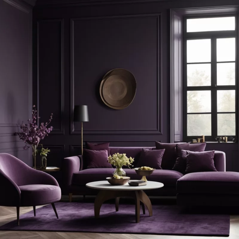
My most requested combination pairs dark violet with warm neutrals—specifically cream, ivory, and soft champagne tones. This creates what I call “approachable luxury.” The neutrals provide breathing space while allowing the dark violet to maintain its dramatic impact. I often incorporate gold or brass accents to complete this sophisticated scheme.
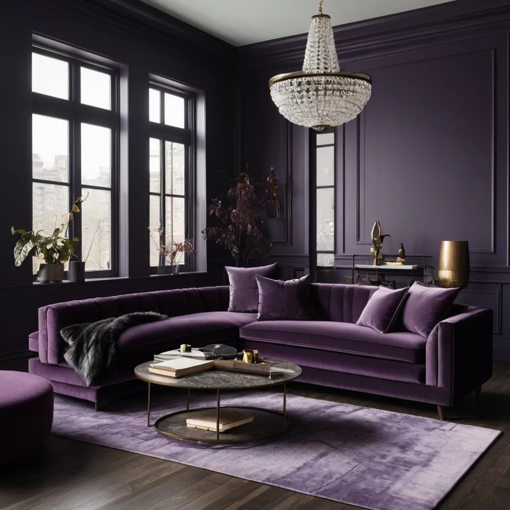
For furniture, I love using a dark violet velvet sofa against cream walls, with gold-framed mirrors and brass table lamps. The result is timeless elegance that photographs beautifully and feels wonderful to live in.
The Modern Jewel Approach
For clients who want something more contemporary, I pair dark violet with deep emerald green and charcoal gray. This combination feels fresh and current while maintaining sophistication. It works particularly well in dining rooms and formal living spaces where you want to create a sense of occasion.
I typically introduce these colors through textiles—dark violet curtains, emerald throw pillows, and charcoal area rugs create a layered, intentional look without overwhelming the space.
The Monochromatic Method
Sometimes the most elegant approach is to work within the purple family itself. I create depth by using various shades from pale lavender to deep plum, with dark violet serving as the anchor. This technique works beautifully in bedrooms and bathrooms where you want to create a cocoon-like feeling.
The key to successful monochromatic schemes lies in varying the textures and finishes. Matte dark violet walls, glossy purple ceramics, and soft lavender linens create visual interest while maintaining color harmony.
Room-by-Room: Where Dark Violet Works Best

Through extensive experimentation, I’ve discovered that dark violet’s success depends heavily on thoughtful room selection and application methods. Here’s what I’ve learned about where this color truly shines.
Living Rooms: The Statement Wall Strategy
In living rooms, I almost always recommend starting with a single accent wall in dark violet. The wall behind the sofa typically works best, creating a dramatic backdrop that anchors the furniture arrangement. I’ve found that this approach provides maximum impact while maintaining the room’s overall balance.
When selecting which wall to paint, I consider the room’s natural light sources and traffic patterns. The goal is to create a focal point that feels intentional rather than overwhelming. I then balance this bold wall with lighter furnishings and strategic metallic accents.
Master Bedrooms: Creating Intimate Luxury
Master bedrooms present unique opportunities for dark violet implementation. I often use it behind the headboard, creating a luxurious hotel-like atmosphere that makes the bed the room’s clear focal point. The key lies in balancing this intensity with soft, light-colored bedding and warm lighting.
For clients who want more color, I introduce dark violet through bedding and window treatments. A dark violet duvet against white sheets creates sophisticated contrast, while matching curtains tie the color scheme together without overwhelming the space.
Dining Rooms: Embracing Drama
Dining rooms can handle more dramatic dark violet applications than other spaces because they’re used less frequently and benefit from intimate, dramatic atmospheres. I’ve had great success with dark violet dining room walls, particularly when paired with warm lighting and metallic accents.
The key to dining room success lies in lighting selection. Warm LED bulbs and dimmer switches ensure that the dark violet feels welcoming rather than cave-like during dinner parties.
Home Offices: Boosting Creativity
For home offices, I use dark violet strategically to create focus zones. A dark violet accent wall behind the desk creates a sophisticated backdrop for video calls while potentially boosting creativity and concentration. I balance this with lighter elements and ensure adequate task lighting to maintain functionality.
Lighting Secrets for Dark Violet Success
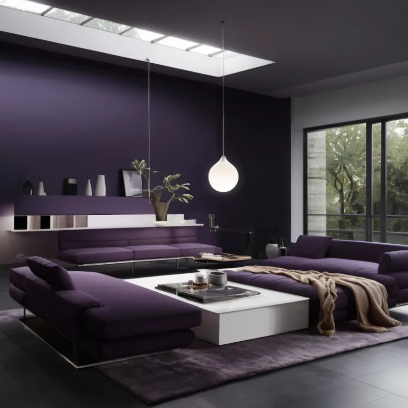
Nothing makes or breaks a dark violet room like lighting. Through years of trial and error, I’ve developed several non-negotiable lighting rules that ensure dark violet always looks its best.
The Warm Light Rule
I never, ever use cool white lighting in dark violet spaces. The color temperature clash creates an unpleasant, harsh effect that makes the violet appear muddy or unwelcoming. Instead, I exclusively use warm white LEDs (2700K-3000K) that enhance the color’s richness and maintain room warmth.
The Layered Lighting Approach
Single overhead lighting is the enemy of sophisticated dark violet rooms. I always implement layered lighting schemes that include ambient, task, and accent lighting. Table lamps with warm bulbs create intimate pools of light, while recessed lighting provides overall illumination. Wall sconces or picture lights can highlight artwork against dark violet backgrounds.
Metallic Fixture Selection
The lighting fixtures themselves become crucial decorative elements in dark violet spaces. I prefer warm metallic finishes—brass, gold, or copper—that complement the color’s luxurious character. These warm metals seem to make the dark violet glow from within, creating depth and visual interest.
Chrome and brushed nickel can work in contemporary settings, but they require careful consideration to avoid creating overly cool aesthetics that fight against the violet’s inherent warmth.
Natural Light Considerations
I always assess a room’s natural light before committing to dark violet. North-facing rooms with cooler natural light emphasize the blue undertones, creating more formal atmospheres. South-facing rooms with warmer light bring out red undertones, resulting in cozier, more intimate feelings.
Rooms with limited natural light require more strategic dark violet application. I might use it on a single accent wall rather than throughout the entire space, ensuring the room doesn’t feel too enclosed.
Textures That Make Dark Violet Shine {#texture-pairings}
The texture choices you make can dramatically alter how dark violet is perceived and experienced. Through extensive experimentation, I’ve identified several material pairings that consistently create stunning results.
Velvet: The Natural Partner
If dark violet has a soulmate in the texture world, it’s velvet. The fabric’s lustrous surface seems designed to showcase rich colors like violet, creating depth and visual interest that’s impossible to achieve with flat finishes. A dark violet velvet sofa becomes an instant focal point that anchors any room’s design.
I’ve used dark violet velvet in dining chairs, throw pillows, and even curtains. The key lies in balancing the luxury of velvet with more casual textures to prevent the space from feeling overly formal.
Natural Wood: Warming the Palette
Wood selection becomes crucial in dark violet spaces. I prefer warm wood tones—walnut, cherry, and mahogany—that complement rather than compete with the color. These natural pairings enhance dark violet’s sophisticated character while adding visual warmth and texture.
Lighter woods like oak can work effectively when used strategically to provide contrast and prevent the space from feeling too heavy. The key lies in ensuring the wood tones harmonize with the overall color scheme.
Metallic Accents: Adding Glamour
Metallic elements provide essential contrast and glamour in dark violet spaces. Brass and gold accessories seem to make the color glow, while copper adds warmth and visual interest. I use metallic picture frames, lamp bases, and decorative objects to create sparkle and prevent the color from feeling flat.
Silver and chrome work in more contemporary settings but require careful integration to maintain the sophisticated warmth that makes dark violet so appealing.
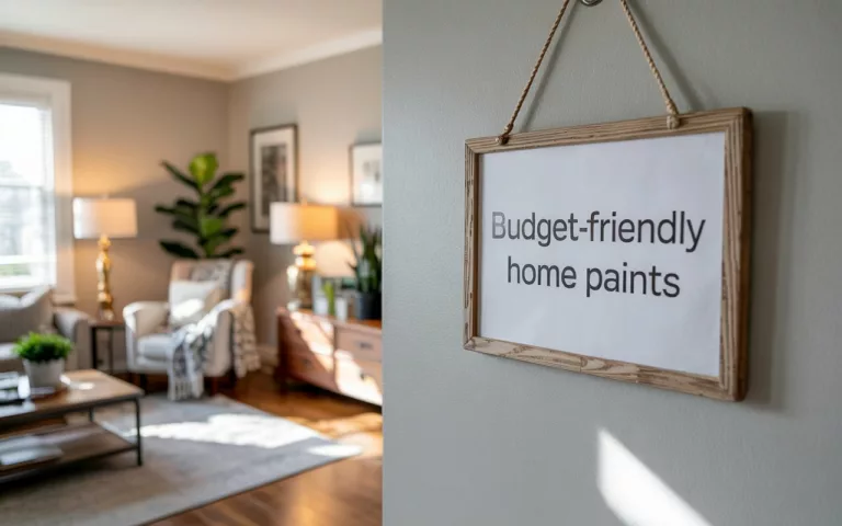
Budget-Friendly Ways to Embrace the Trend {#budget-friendly}
Not every dark violet transformation requires a major financial investment. I’ve developed several budget-conscious approaches that deliver maximum impact without breaking the bank.
The Paint Solution
Paint remains the most cost-effective way to introduce dark violet into any space. A single accent wall can completely transform a room’s character for less than $50 in materials. I always recommend investing in quality paint and primer for the best results and longevity.
For DIY painters, proper preparation becomes crucial with dark colors. I’ve learned that taking time with primer application and using quality brushes prevents streaks and ensures professional-looking results.
Textile Transformations
Changing existing accessories to dark violet versions provides immediate color integration at minimal cost. Throw pillows, area rugs, and window treatments can transform a space’s appearance while preserving major furnishings and architectural elements.
I’ve found excellent dark violet accessories at discount retailers, thrift stores, and online marketplaces. With patience, you can assemble a cohesive color scheme without paying retail prices.
DIY and Upcycling Projects
Some of my favorite dark violet elements have come from upcycling projects. Existing furniture can be transformed with dark violet paint or reupholstery, creating custom pieces that perfectly fit both budget and design requirements.
I’ve helped clients paint bookshelves, refurbish dining chairs, and even create custom artwork in dark violet. These handmade elements often possess character and uniqueness that purchased items cannot match.
Professional Tips I’ve Learned Along the Way {#professional-tips}
Years of working with dark violet have taught me several crucial lessons that can make the difference between success and disappointment.
The Sample Rule
I never recommend dark violet without extensive sampling. The color can appear dramatically different under various lighting conditions and against different surfaces. I always test paint samples on multiple walls and view them throughout the day before making final decisions.
For fabrics and furnishings, I bring samples home and live with them for several days. Colors that look perfect in store lighting can appear completely different in your actual space.
The 60-30-10 Principle
When incorporating bold colors like dark violet, I follow the 60-30-10 rule religiously. In most residential spaces, dark violet works best as either the secondary color (30%) or accent color (10%). Using it as the dominant color (60%) requires exceptional skill and the right space characteristics.
The Undertone Consideration
Not all dark violets are created equal. Some lean toward blue (cooler), while others lean toward red (warmer). I always consider these undertones when selecting complementary colors and materials. Matching undertones throughout the space creates cohesive, professionally crafted appearances.
The Balance Imperative
Dark violet requires careful balance to prevent overwhelming a space. I always incorporate lighter elements—whether through paint colors, fabrics, or accessories—to provide visual breathing room and maintain livability.
Making Dark Violet Work Year-Round {#seasonal-adaptations}
One of dark violet’s greatest strengths is its seasonal adaptability. I’ve developed strategies for keeping dark violet spaces fresh and appropriate throughout the year.
Spring and Summer Lightening
During warmer months, I introduce lighter, more refreshing elements to balance dark violet’s intensity. White or cream accessories, lightweight fabrics, and increased natural light prevent the color from feeling too heavy during bright summer days.
Fresh flowers and greenery provide excellent seasonal updates, with their natural colors creating beautiful contrasts that feel appropriate for spring and summer. These organic elements soften the color’s intensity while maintaining its elegant appeal.
Fall and Winter Enrichment
Cooler months provide perfect opportunities to enhance dark violet’s cozy qualities. I add richer textures like wool throws, cashmere pillows, and faux fur accents that complement the color while providing seasonal comfort.
Enhanced lighting becomes particularly important during shorter days. Additional table lamps, candles, and accent lighting help maintain warmth and prevent dark violet spaces from feeling gloomy during winter months.
Why Dark Violet is Here to Stay {#future-outlook}
Based on my observations of design trends and consumer behavior, I believe dark violet has exceptional staying power that extends far beyond typical trend cycles.
Unlike colors that feel tied to specific moments in time, dark violet possesses historical depth and cultural significance that suggest long-term relevance. Its associations with luxury, creativity, and sophistication are deeply ingrained and unlikely to change with shifting fashion preferences.
The color’s versatility across multiple design styles provides additional stability. I’ve successfully used dark violet in traditional, contemporary, and eclectic settings, demonstrating its adaptability to changing design preferences while maintaining core appeal.
Consumer research indicates growing confidence in bold color choices as homeowners become more design-savvy. This trend toward color confidence supports sustained interest in sophisticated hues like dark violet that provide both impact and refinement.
The rental market’s evolution toward more design-forward properties creates additional opportunities for dark violet implementation. As property owners recognize color’s role in attracting quality tenants, sophisticated color choices become increasingly viable investments.
Conclusion: Embracing the Dark Violet Revolution
After working with dark violet across countless projects, I can confidently say that this color represents more than just a trend—it’s a return to fearless, personal expression in interior design. The transformation I’ve witnessed in clients’ homes and their emotional responses to these spaces convinces me that dark violet offers something our neutral-obsessed design culture has been missing.
The key to dark violet success lies not in following rigid rules, but in understanding the color’s unique characteristics and respecting its intensity. When properly implemented with attention to lighting, balance, and complementary elements, dark violet creates spaces that are both sophisticated and deeply personal.
Whether you’re ready to commit to a dark violet accent wall or prefer to start with accessories and textiles, this color offers endless possibilities for creating homes that reflect your personality while maintaining timeless appeal. The dark violet revolution isn’t just about following trends—it’s about embracing color’s transformative power to create spaces that truly nurture and inspire.
As we continue moving toward more personalized, meaningful interior design, colors like dark violet will only become more valuable. They offer the depth, sophistication, and emotional resonance that our homes need to support our complex modern lives while providing the beauty and inspiration we crave.
For more interior design inspiration and color trend analysis, explore our related articles on seasonal color palettes and luxury home design trends. Don’t forget to check out leading paint manufacturers like Sherwin-Williams and Benjamin Moore for the latest color collections and professional-grade options.
Art11deco

